Labels
Client
San Devan Honey
Service
Packaging and Branding
Tools
Illustrator
Date
2025
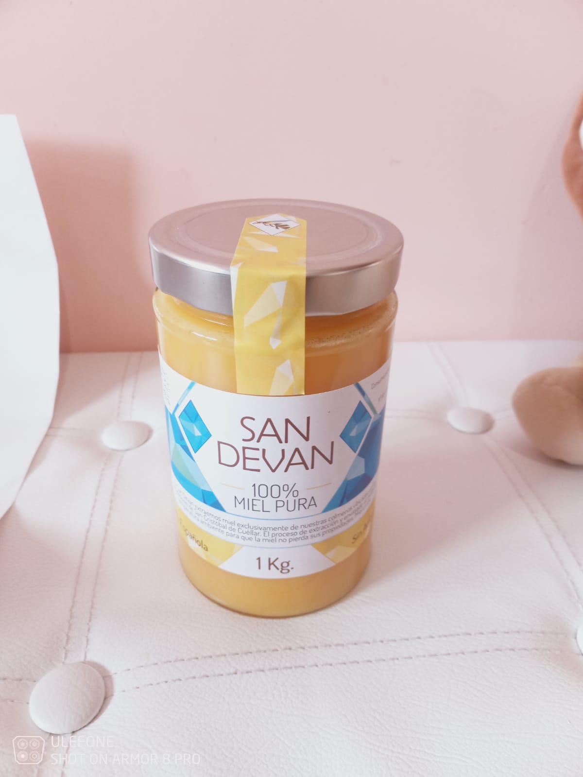
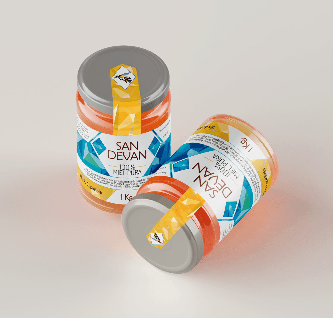
This project consisted of the redesign of the label for honey San Devan, with the aim of modernizing its image and improving its visual impact at the point of sale. We worked with a pre-existing logo, integrating it harmoniously within a more attractive, premium design with a stronger visual identity.
Key Points of Design
Color Palette: A combination of blue and gold tones was used to create a high contrast with the natural color of honey, highlighting its purity and quality.
Geometric Elements: Inspired by honeycomb structures, the triangular patterns create a modern and dynamic feel without losing the artisanal essence of the product.
Typography: A clean and sophisticated typography was chosen to reinforce the perception of quality and tradition.
Security Seal with Bee Icon: Adds a distinctive element, reinforces authenticity, and provides extra security to the consumer.
Well-Balanced Wrap Label: Ensures that the product looks appealing from any angle on the shelf.

The final design achieves a stronger and more memorable visual identity, elevating the product within its category and making it stand out in the market.