WebbEllis. Rugby Camps
Client
Webb Ellis
Service
Identidad Visual
Tools
Photoshop Illustrator
Date
2024
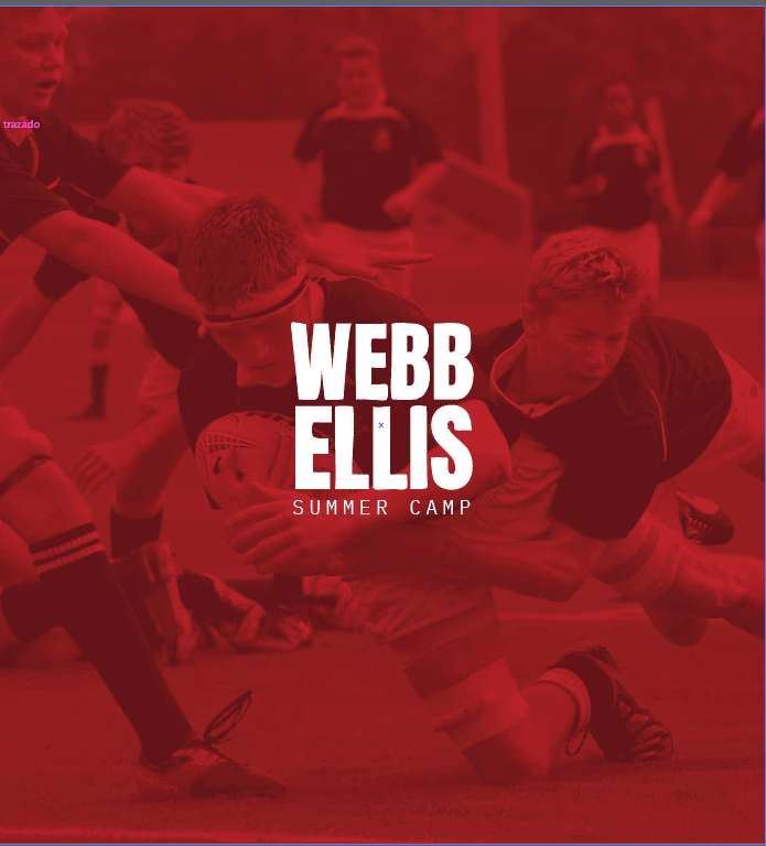
The task consisted of designing the visual identity for Webb Ellis Summer Camp, a rugby camp aimed at children and teenagers. The objective was to create a modern, dynamic, and attractive logo that reflected the passion, energy, and spirit of this sport, while also conveying warmth and fun to connect with the young audience.
Design Development
Wordmark Logo: A typography-based logo was chosen with custom modifications to each letter to provide originality and movement, reflecting the intensity and action of rugby.
Typeface Choice: A strong and robust typeface was used, evoking solidity and confidence, essential in a sport like rugby.
Color Palette: The color red was the central choice as it conveys dynamism, emotion, and passion, fundamental values of the camp. Additionally, its warmth and energy reinforce the identity of the project.

Visual Impact: An eye-catching and powerful design that captures the attention of the target audience.
Proximity and Fun: Small variations in the letters add a touch of fun and originality, aligning with the youthful spirit of the camp.
Versatility: The logo adapts perfectly to different applications, from posters and uniforms to social media and merchandising.
Strong Identity: A branding that balances professionalism and emotion, highlighting the essence of rugby in an accessible and appealing way for the younger audience.
This design achieves a perfect balance between strength, dynamism, and proximity, representing the spirit of the Webb Ellis Summer Camp.